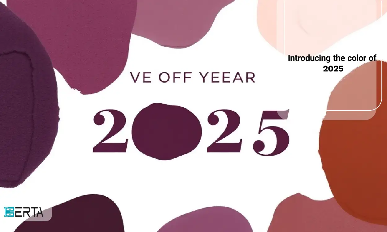
The color of the year 2025 has just been announced by the Benjamin Moore Company. This company, which is known as one of the most reliable brands in determining colors of the year, has announced the color of the year 2113-2113 Cinnamon Slate Ansarean as the color of the year. This color is a combination of plum and velvety brown colors, which adds to the beauty and charm of spaces and conveys a sense of warmth and peace.
The importance of choosing the color of the year
The selection of the color of the year by prestigious companies such as Pantone and Benjamin Moore has a great influence on interior design trends, fashion, and art. These colors not only represent the current trends in the world of design but can also have profound effects on human emotions and behaviors. Colors can change a space, stimulate emotions, and even affect a person's mood.
Psychological effects of colors
Colors can evoke different emotions in humans. For example, warm colors like red and orange can convey energy and excitement, while cool colors like blue and green create a sense of calmness and stillness. The color of 2025 with the combination of plum and velvety brown can create a sense of warmth, comfort, and security in spaces.
Communication with culture and society
Choosing the color of the year can also indicate cultural and social trends. For example, in recent years, due to the increasing attention to environmental and sustainable issues, colors that convey the sense of nature and earth have received more attention. Ansari's 40-2113 cinnamon color can also meet these demands due to the combination of natural colors.
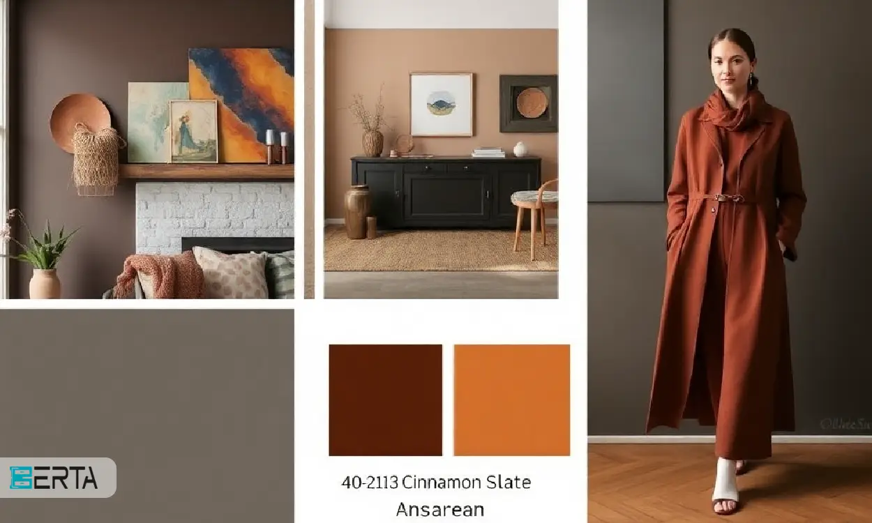
40-2113 Cinnamon Slate Ansarean Color Features
Ansarean Cinnamon Slate 40-2113 color with an attractive combination of plum and velvety brown gives a sense of warmth and comfort to spaces. This color can be used well in the interior design of homes, offices, and public spaces. Since this color is easily combined with other colors, it can be used in different decorations.
Combination of colors
The combination of plum color and velvet brown gives this color a special depth and charm. As a cool color, plum conveys a sense of calmness and stillness, while velvety brown, as a warm color, creates a sense of warmth and closeness. This combination can help create a balanced and pleasant atmosphere.
Color applications in design
This color can easily be used in the interior design of homes, offices, and public spaces. For example, this color can be used in walls, furniture, and decorative accessories to create a warm and welcoming atmosphere. Also, this color can be used in the design of open spaces such as balconies and yards.
Color applications of 2025
1- Interior design
This color can be used in walls, furniture, and accessories to create a warm and welcoming atmosphere. For example, walls painted in Ansarean Cinnamon Slate 40-2113 can serve as a beautiful backdrop for artwork and other decorations.
2- Fashion
Fashion designers can use this color to design clothes for the new season and join the new trends in the fashion world. Plum and brown velvet colors can be used in the design of formal and informal clothes and add to their beauty and charm.
3- Art and graphics
Artists and graphic designers can use this color to create their artistic and graphic works. This color can be used in the design of posters, book covers, and other works of art and give them a special charm.
Complementary colors in 2025
2025 has given the world of fashion and design a new and attractive effect by introducing the Future Dusk color as its main color. But in addition to this color, reputable institutions such as Pantone have also introduced other colors as outstanding colors of the year, each of which has unique characteristics and can be used as complementary colors in different designs.
1- Transcendent Pink
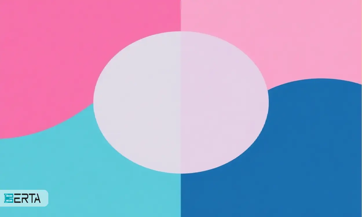
One of the attractive and gentle colors introduced as a key color in 2025 is pink. This color evokes a sense of nostalgia and comfort with a warm and pleasant tonality. As a color that lies on the border between modernity and tradition, pink will be impressively used in interior decoration and clothing. This color can be used as the main color in the design of living spaces or bedrooms and conveys a sense of comfort to the residents by creating a calm and pleasant atmosphere. Also, in the world of fashion, this color can be used in the design of clothes and accessories and give the styles a special and unique effect.
2- Turquoise blue (Aquatic Awe)
Another color introduced as a prominent color in 2025 is turquoise blue. This fresh and lively color refers to open skies and deep seas and can convey a sense of clarity and peace to spaces. Turquoise blue will be used especially in modern spaces that seek to induce a sense of calmness and transparency. This color can be used in the design of interior decoration, including painting the walls, choosing furniture and accessories, and creating a pleasant and relaxing atmosphere. Also, in the world of fashion, this color can be used as an attractive and lively color in the design of clothes and accessories, giving energy and life to styles.
conclusion
The choice of the color 2025 by Benjamin Moore shows the desire to create a warm and pleasant atmosphere that can have positive effects on our daily lives. Due to the attractiveness and various uses of this color, it is expected that in the coming years, we will see its wider use in different designs. The colors of the year serve not only as a trend but also as a source of inspiration for creativity and innovation in the world of design. Therefore, paying attention to these colors can help us to design our spaces more beautifully and pleasantly.


43456.jpg)
 Whatsapp
  Telegram
